IRIA VICTORIA
  • Work
  • About
  • LinkedIn ↗

HI, I'M

IRIAVICTORIA

I design products that help people make better decisions.

From acquisition to everyday engagement, I transform complexity into experiences people can confidently understand, trust and use.

Product StrategyComplex SystemsUX ResearchBehavioral DesignB2B SaaSMobileGrowthE commerceProduct StrategyComplex SystemsUX ResearchBehavioral DesignB2B SaaSMobileGrowthE commerceProduct StrategyComplex SystemsUX ResearchBehavioral DesignB2B SaaSMobileGrowthE commerceProduct StrategyComplex SystemsUX ResearchBehavioral DesignB2B SaaSMobileGrowthE commerce
SEE MY WORK

My Work

Operations room at dusk with autonomous driving monitoring screens

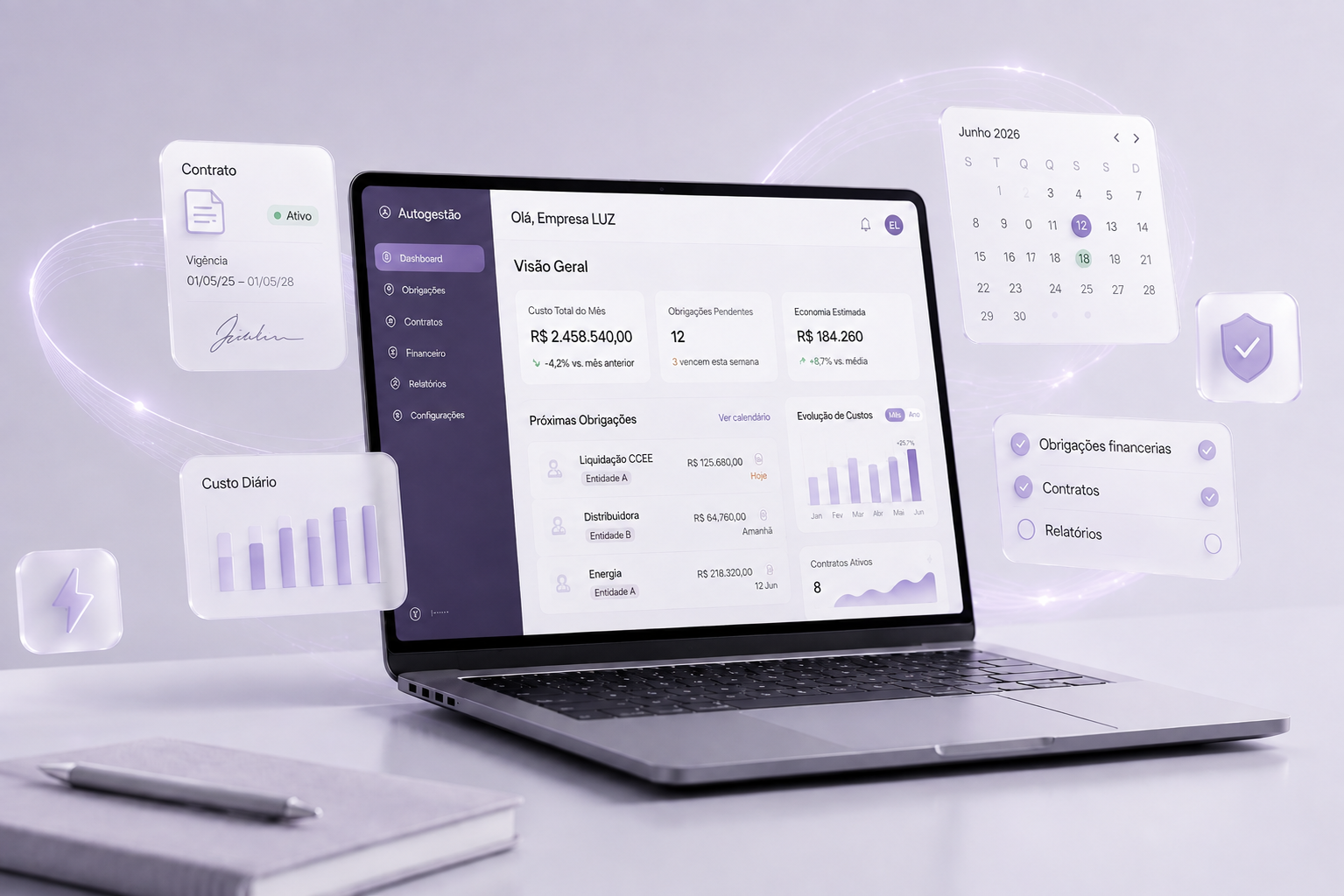
Designing Safe Autonomy

Complex Systems

How do you design confidence inside complex operational systems?

Layered translucent glass panels with faint data lines

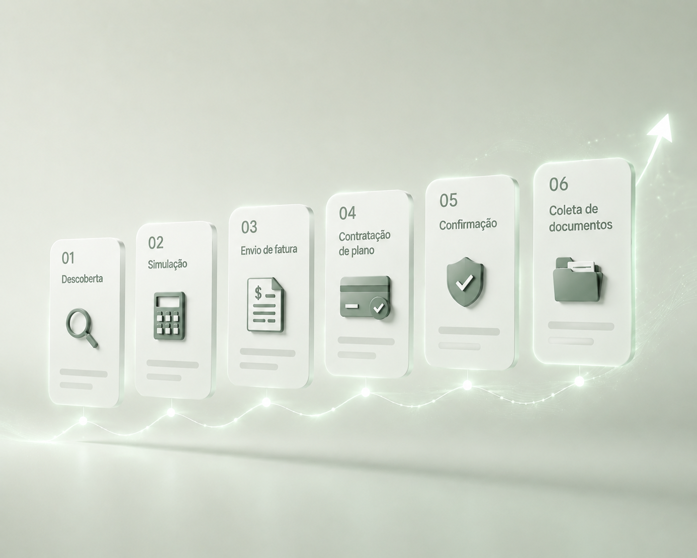
Designing Trust Across the Customer Journey

Growth

How do you reduce uncertainty before customers commit?

Soft curved concrete stairs in warm daylight

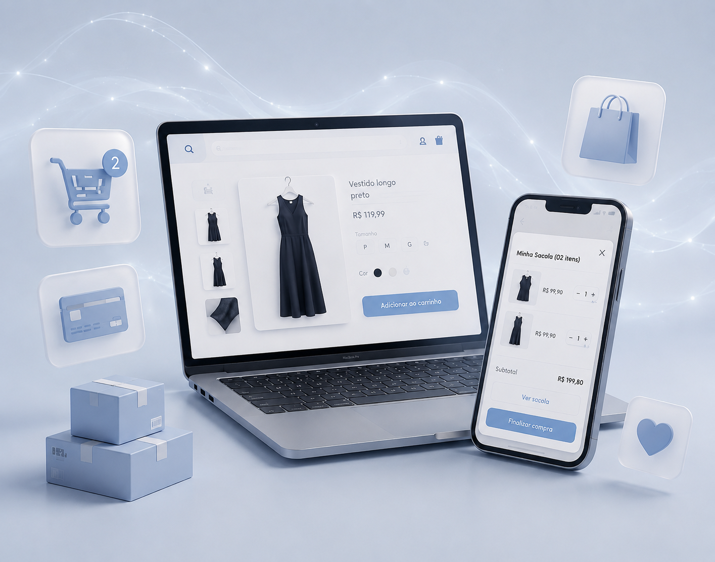
Helping Customers Stay in Flow

E-commerce

How do you reduce friction without interrupting purchase momentum?

Paper grocery bag and everyday groceries in warm light

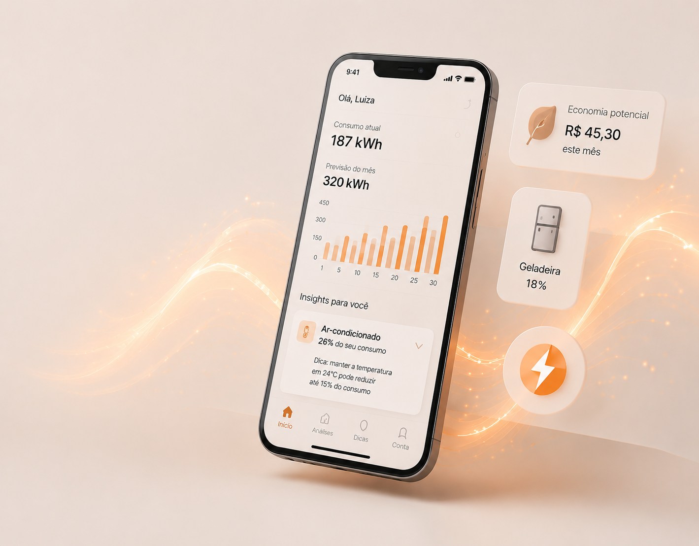
Turning Consumption Data into Everyday Decisions

Engagement

How do you transform passive data into meaningful daily value?

About

Senior Product Designer with 5+ years of experience designing digital products from discovery to delivery.

I work at the intersection of product strategy, user research, business goals and technology, helping teams transform complexity into products people can confidently use.

Across B2B SaaS, mobile products and digital commerce, my work has always followed the same principle: understand the real problem before designing the solution.

I believe great products are not defined by the number of features they offer, but by the confidence they give people to make better decisions.

Design Philosophy

Every project solves a different product problem.

AcquisitionPurchaseProduct UsageRetention

Different products.

Different industries.

The same way of thinking.

“

I design products that help people make better decisions.

”

LET’S WORK TOGETHER

Have a product challenge worth solving? Let’s talk.

EmailLinkedIn ↗Download CV ↗
IRIA VICTORIA↑ BACK TO TOP
Mini Cart Experience03

Mini Cart Experience

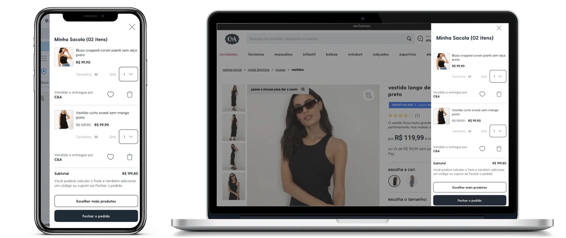
Helping Customers Stay in Flow

Redesigning the purchase experience by protecting decision momentum.
Hero Image

Overview

Industry
Fashion Retail
Company
C&A Brazil
Product
E-commerce
Focus
Purchase Experience
Role
Product Designer
Scope
Discovery · UX Research · Analytics · UX/UI Design · Prototyping · Usability Testing · MVP Validation
Timeline
2022

At a glance

Challenge
Help customers review and modify their cart without interrupting the momentum of the shopping journey.
My contribution
Combined behavioral analysis, research, analytics and usability testing to redesign and validate the Mini Cart experience before scaling it.
Key decision
Keep relevant information and cart decisions within the shopping context instead of repeatedly sending customers to a separate cart page.
Outcome
A clearer purchasing experience with fewer unnecessary interruptions, reduced context switching and defined success metrics for post-launch evaluation.

This case demonstrates

E-commercePurchase ExperienceUX ResearchAnalytics (Hotjar + GA)Behavioral DesignInformation ArchitectureDecision ArchitectureUsability TestingPrototypingMVP ValidationProduct MetricsExperimentation

Great shopping experiences don't happen at checkout.

They happen in the moments before people decide to leave. The Mini Cart wasn't just another interface component. It was one of the last opportunities to help customers continue their purchase without interrupting their momentum. The challenge wasn't redesigning a cart. It was understanding why customers hesitated before completing their purchase, and removing those moments of hesitation without adding complexity.

Before redesigning the interface, I studied customer behavior.

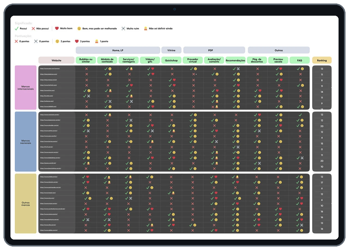
Rather than starting with visual improvements, I wanted to understand how customers actually behaved throughout the purchase journey. The discovery combined quantitative and qualitative inputs, including:

  • •Google Analytics
  • •Hotjar recordings
  • •Internal research
  • •Benchmark analysis
  • •Stakeholder workshops
  • •CSD Matrix

Looking across these different sources revealed an important pattern. Customers weren't abandoning their purchase because the cart looked outdated. They were losing momentum while making decisions. That insight reframed the project. Instead of optimizing a component, the goal became protecting the purchasing flow.
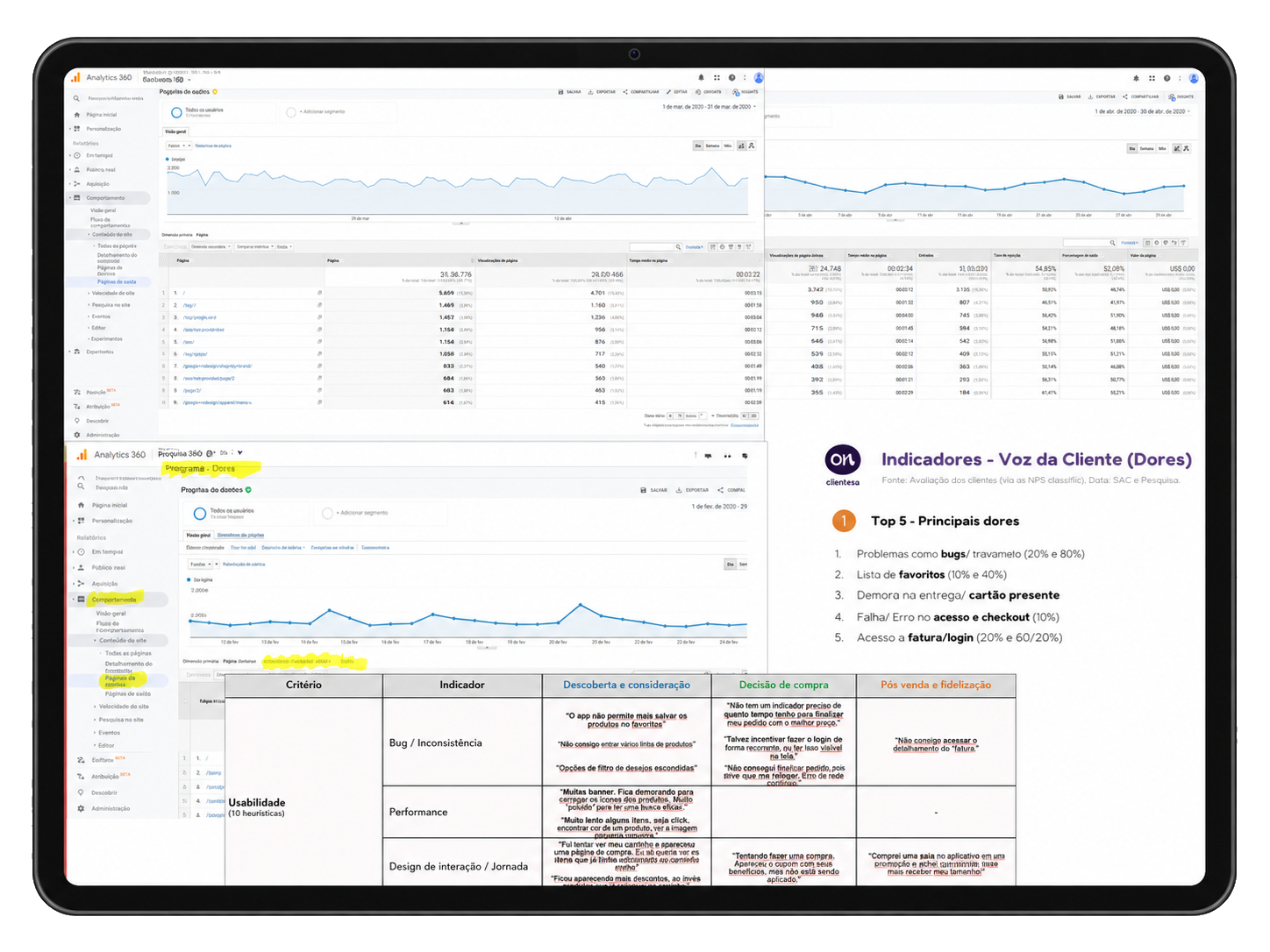
Internal Data and Research
Analytical Benchmark

Three principles guided every decision.

Keep customers in flow.

Every interruption is another opportunity to abandon the purchase.

Reduce decision fatigue.

The easier the next decision becomes, the easier it is to continue.

Keep relevant information close to the decision.

Users shouldn't have to leave the purchasing flow to answer simple questions.

“

Reflection

Every interface was designed to preserve momentum.

Remove unnecessary interruptions.

The original Mini Cart required customers to constantly switch context before deciding what to do next. Important information was fragmented, making users interrupt their purchase to verify product details elsewhere. The redesign brought essential information closer to the purchasing decision, reducing unnecessary navigation while keeping customers inside the buying flow.
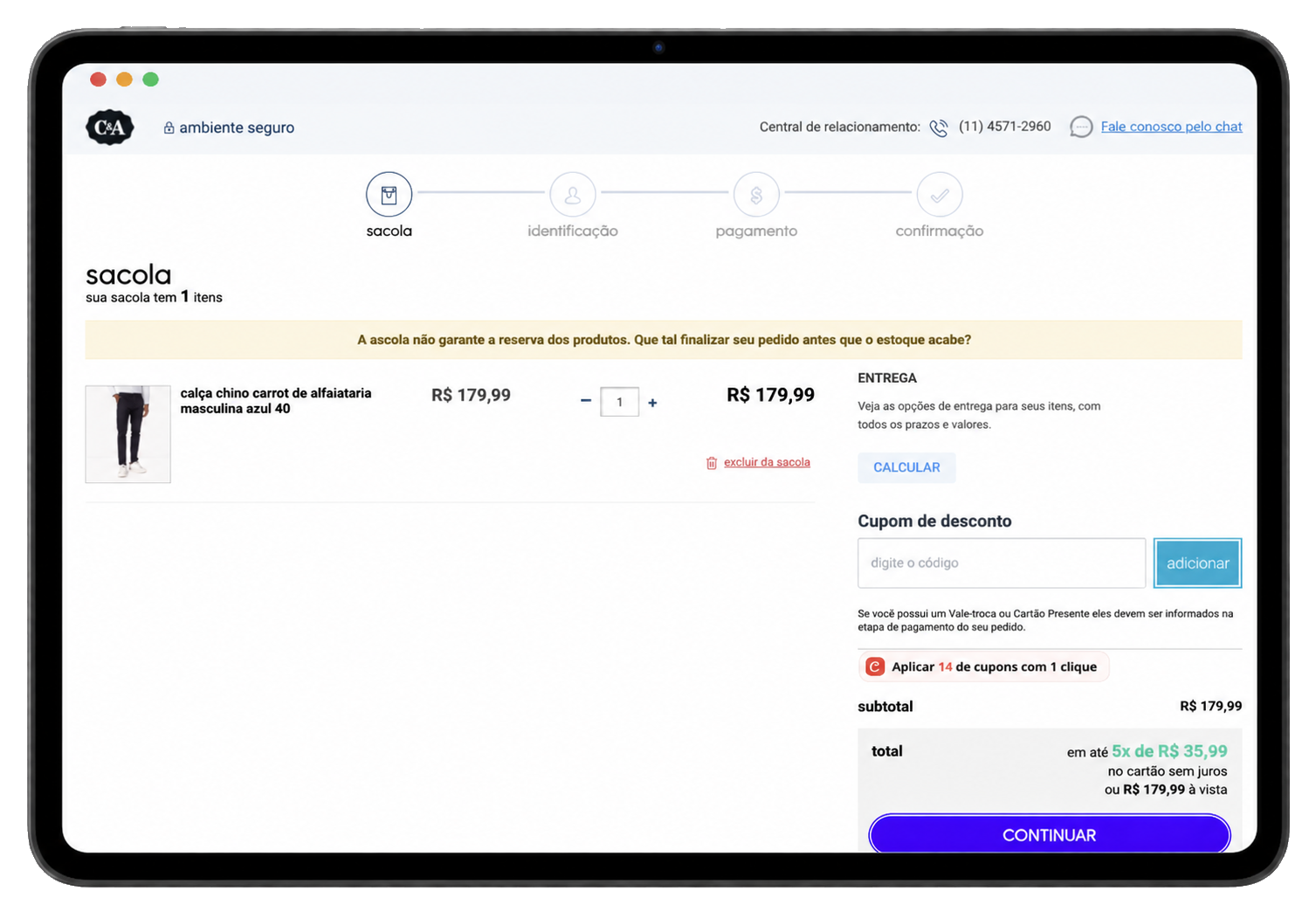
Before Redesign
Before Redesign
“

Reflection

Customers rarely abandon purchases because one screen is difficult.

They leave when the experience repeatedly interrupts their momentum.

Make the next decision obvious.

Rather than exposing every possible action, the redesigned experience prioritized the next meaningful decision. Hierarchy, spacing, CTA placement and information architecture were redesigned to reduce visual competition. Instead of asking users to evaluate everything at once, the interface guided attention toward the action that mattered most.
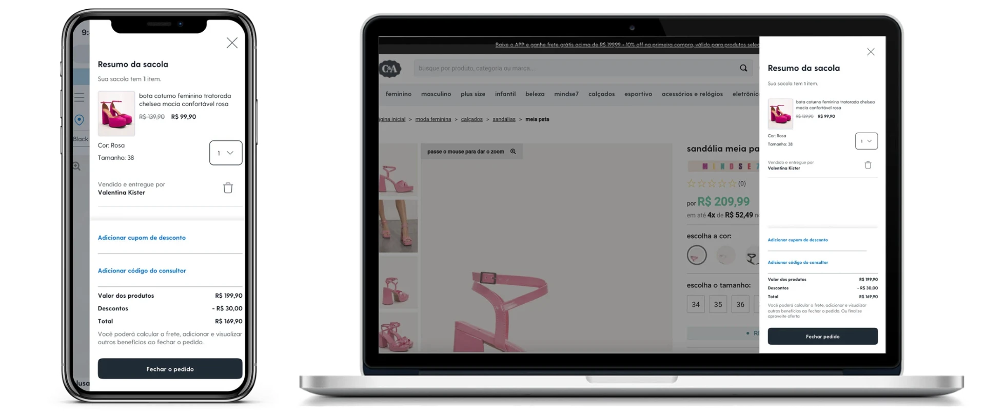
Mini Cart UI
Mini Cart UI
“

Reflection

Great interfaces don't ask users to think harder.

They reduce the number of decisions competing for attention.

Validate before scaling.

Rather than relying on assumptions, every major decision was validated before implementation. Interactive prototypes were tested with users to understand navigation patterns, task completion and decision-making during purchase. Feedback wasn't treated as validation of the interface. It became validation of the product hypothesis itself. The MVP allowed the team to learn quickly while reducing implementation risk.
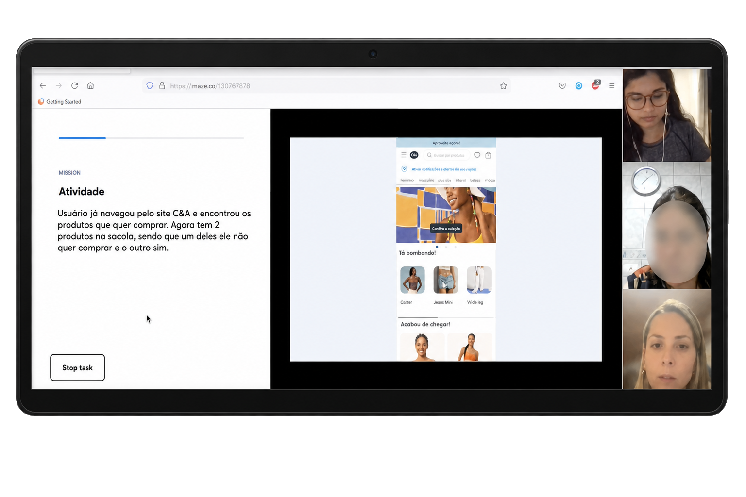
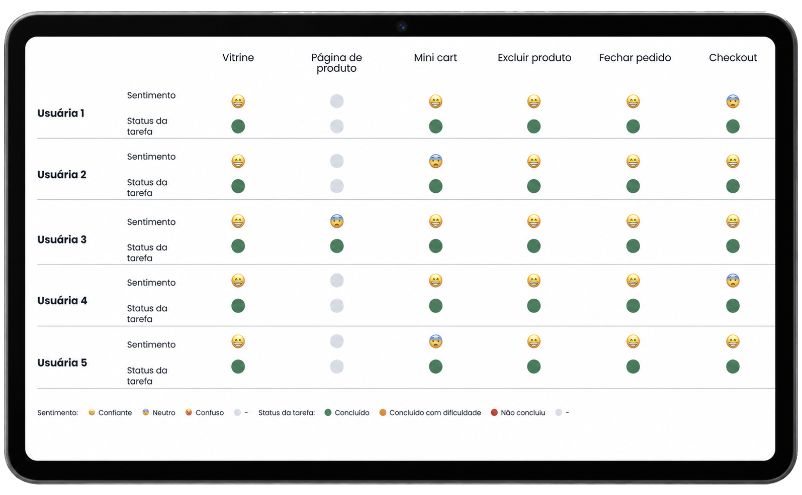
Usability Testing
Usability Testing
Usability Matrix Model
“

Reflection

Validation isn't about confirming ideas.

It's about discovering where assumptions fail.

Measure behavior, not opinions.

The project didn't end when the interface was delivered. KPIs and OKRs were defined to understand how the redesigned experience influenced customer behavior after launch. Metrics became part of the design process, helping the team evaluate adoption, engagement and purchase completion rather than relying exclusively on qualitative feedback.
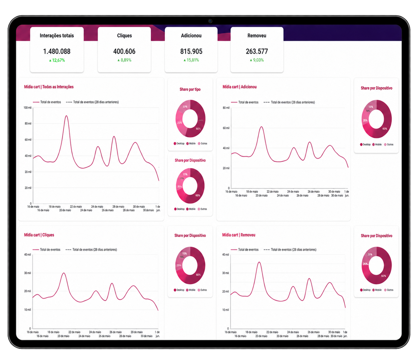
Metrics Dashboard
Metrics Dashboard
“

Reflection

Good design decisions should continue generating evidence after launch.

Outcomes

Improving the Mini Cart wasn’t about making it look better.

It was about creating a clearer purchasing experience, validating the direction before scaling and establishing a stronger foundation for measuring customer behavior after launch.

Product

  • Created a clearer purchasing experience with fewer unnecessary interruptions.
  • Improved information hierarchy during key decision moments.
  • Reduced context switching by keeping cart decisions within the shopping journey.

Team

  • Grounded product decisions in analytics, research and usability testing.
  • Validated the MVP before full implementation.
  • Strengthened collaboration between Product, Engineering and Business.

Business

  • Established a stronger foundation for monitoring engagement and conversion.
  • Defined success metrics for evaluating the experience after launch.
  • Created better visibility into customer behavior across the purchase journey.

Looking back

Looking back, the biggest lesson wasn't about e-commerce. It was about momentum. Purchase decisions rarely happen all at once. They happen through a sequence of small interactions. Every unnecessary interruption creates another opportunity for hesitation. This project reinforced something I still apply today. Good product experiences don't push people toward decisions. They remove the obstacles that prevent those decisions from happening naturally.

Great purchase experiences don't accelerate decisions. They protect momentum.